Monday, June 18, 2012

New Quilt - "Blue Space #1"

In addition to having sat around nearly finished in a box for at least three years, this quilt has an additional claim to fame.  The curlycues cut from mat board that are attached to the center of the quilt have been with me since high school! That's right, in one of my first ever printmaking classes we were assigned to create plates for embossing watercolor paper by cutting imagery into mat board.  Several coats of gesso later, it turns out that thing will not only be able to pull a giant number of embossed prints but also survive to be reinvented fourteen years later!

Another fun element of this quilt is the background photographs, which I took of blueberries floating in a bowl of water and then printed onto iron-on transfers.  I like that it's obvious what you're looking at but at the same time they seem like they could be something else entirely. 
Blue Space #1
"Blue Space #1"

Title: "Blue Space #1"
Materials: half of a dollar store placemat, plastic leaves, metal eyelets, puzzle pieces, plastic dots, prong settings, perle cotton, muslin, iron-on transfers, laminated imagery, mat board, acrylic paint, oil paint stick
Dimensions: 9.5" by 13"
Date: 2012
 
quilt-blue-space2
Puzzle pieces, iron on transfers, metal eyelets and little plastic bauble thingies that are meant for floral arrangements

The little plastic bauble things at the bottom of the photo above are one of the sad disappointments I've had in my search for art materials.  I found a big bag of them at a craft store - they're meant to be placed in the bottom of a vase as an attractive way to hold up floral arrangements.  They seemed PERFECT for adding small dots of imagery to my quilts, because they're produced by dripping tiny amounts of molten clear plastic onto a surface, which produces basically a little round clear cabochon the perfect size to fit into a 30SS prong setting meant for Swarovski crystals. My method of using these little guys involved using a 3/16" hole punch to make tiny dots of content from magazine pages which I would adhere to the flat side of the little baubles using clear epoxy.  I could then attach them anywhere on a quilt using the prong settings.  They were gorgeous.  If this seems too perfect to be true, that's definitely because it is.  The fatal flaw of these little gems, which I did not discover until I had used them in a number of projects, is that they are extraordinarily brittle.  Even a slight impact against a hard surface causes them to shatter. It was tragic to give up on this idea, but I refuse to use anything in my art that will randomly shatter!

quilt-blue-space3
Swirly thing carved into a piece of mat board


This piece of mat board with swirly things carved into it is one of those items that I have had for many, many years.  I carved the little swirls to make an embossing plate during one of my first ever printmaking classes, way back in high school. The pink around the edge is there because the project in question involved combining the embossing with a silkscreened image, and my idea was to leave a little window in my red ink to accommodate the embossing.  Afterward, of course, I couldn't possibly get rid of the mat board with the swirls carved into it - it only took me fifteen years to find a home for it!

Tuesday, June 12, 2012

New Quilt: "Map of Regional Attractions #3"

quilt-map-of-regional-attractions3.1
"Map of Regional Attractions #3"

Title: "Map of Regional Attractions #3"
Materials: cottons & synthetic fabrics, tulle, lace, inkjet printed cotton, oil paint stick, laminated imagery, perle cotton, Swarovski crystals, press-on sequins
Dimensions: 20.5" by 14.75"
Date: 2012

This quilt makes heavy use of oil paint sticks, which I have recently realized are an incredibly powerful tool for adding texture or imagery to a quilt. The shark was made using the paint stick "carbon paper" technique I demonstrated in this post, and other areas have antique gold pigment applied using the tip of my finger onto already quilted areas.  This produced a beautiful and dramatic effect that I will definitely have to explore further.

quilt-map-of-regional-attractions3.4
The shark was created by tracing a drawing on paper with paint stick pigment liberally applied to the back side.

The graph-y looking images were from a book titled "101 Ways to Use Your Sweep Generator," which was found at a Goodwill in Seattle a million years ago.  I had no idea at the time what a Sweep Generator was, and I have to admit, I still have no idea because instead of reading the book like a normal person, I immediately cut out all the fabulous illustrations and laminated them.  They've been slowly finding their way into projects ever since.

quilt-map-of-regional-attractions3.2
The little rectangle of Swarovski crystals were leftover from a Rockette costume.

This quilt was mostly completed while my new machine was out for repairs, and so I got to know the old Pfaff again.  That thing may be old, but it's still a rock star in my book!

quilt-map-of-regional-attractions3.3
The photograph printed onto cotton at the bottom of the quilt is of the frozen surface of the Harlem Meer in Central Park.  I used hand-quilting to accentuate the bubbles captured in the ice.

One question about this quilt that will just have to be answered by time is whether oil paint stick pigment will remain on fabric without being heat-set. This was the project for which I decided to try out Poly-Fil Hi-Loft batting, which it turns out gets all compressed and useless when you expose it to heat, so I just have to hope all the gold will stay on there.  Maybe I'll post a follow-up in ten years!

Thursday, June 7, 2012

Art Show: "Midwest Filipino" by Daniel Ballesteros, presented by Chashama.org

Today, I had one of those wonderful serendipitous New York moments that I personally have too few of because I almost never leave my apartment.  I was walking along 37th Street, heading towards the subway, when I spotted a teeny tiny storefront gallery full of what looked like hundreds of miniscule black and white photographs.  A sign on the door encouraged me to come in, so I did just that, and I'm so glad I did - this is exactly my kind of art!   

All the tiny photos turn out to be the work of Daniel Ballesteros, a photographer originally hailing from St. Louis, Missouri and currently operating in Brooklyn. See the bottom of this post for location and dates!

Ballesteros makes tintypes, a photographic process I did not know much about - Wikipedia describes the process this way: "a photograph made by creating a direct positive on a sheet of iron metal that is blackened by painting, lacquering or enamelling and is used as a support for a collodion photographic emulsion."

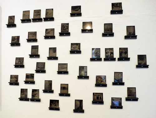
The show contains two different presentations for Ballesteros's photographs.  The first group are individually mounted to the wall on tiny custom supports that appear to be made from an upside down version of the channeled molding that holds the chalk at the bottom of a blackboard.  They're probably no more than 3 by 4 inches, and it is incredibly rewarding to get up close to each one and peer at it to see what is revealed.

The second presentation method involves photographic prints on glass, in series of two or three or many more, held into simple wooden frames using loops of wire.  These are incredibly beautiful and mysterious, and there are excellent flaws in the glass or the emulsion that I was particularly drawn to. 
 
Daniel Ballesteros - Midwest Filipino 2012 no.1
Small individual photographs by Daniel Ballesteros

I'm just going to quote some big chunks of Ballesteros's website, because his artist statement is well written and informative, and a far cry from the pretentious crap that can be either written after hours of painstaking fruitless labor or, much more easily, created with zero effort using the Arty Bollocks instant artist statement generator.  I promise I won't always use all these giant block quotes, but I like Ballesteros's description of his work more than any description I could come up with, and if that makes me lazy, I won't even try to get out of being called that! Anyway, here's some of what he has to say about his series, "Midwest Filipino."
"This project is about my experience as a Filipino American coming from an area of the U.S. with very little Filipino culture, and a family that did what it could to assimilate as best as possible. The first part of the project, addressing the successful assimiliation of my Filipino Grandfather into the U.S., is a series of photographs of the environment and people that helped to shape my identity - without Filipino influence."
Daniel Ballesteros - Midwest Filipino 2012 no.2
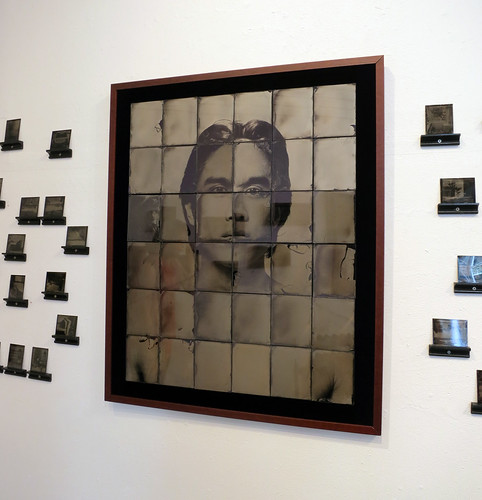
A larger work comprising thirty individually printed photographs on glass

(continued) "The Midwest is in many ways a perfect backdrop for assimilation stories. It once attracted numerous European immigrants (Dutch, German, French, Italian, and Irish) who filled many midwest neighborhoods along with their countrymen. Over time, those culturally rich communities "Americanized" and lost much of their own identity among the suburban sprawl of tract houses and strip malls that now typify the region."
Daniel Ballesteros - Midwest Filipino 2012 no.3
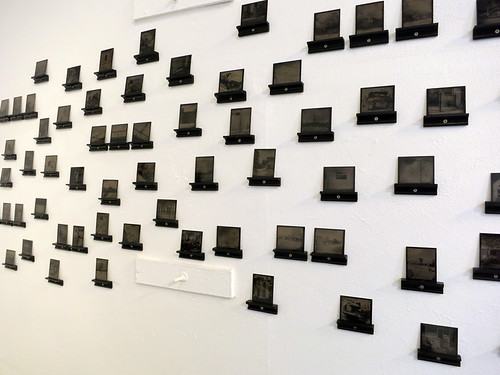
More of the tiny images - I adore the way they work with the weird existing wall features in this gallery space.

(continued - I added the bold part because I just think this bit is so very cool!) "For this series, the self-portrait of Midwest Filpino, I have made wet plate collodion positive images on both metal and glass from digital snapshots. Once a plate is made, the digital file is then erased, so that one unique collodion plate remains--a single physical token pulled from a digital recording--looking at its expression, its storage abilities that we embrace and pretend to manage. As external hard drives stack up on desktops (virtual and actual), the topic of utility arises, highlighting how helpful modernization really is, and our tendency to save everything (because it is so easy). In my work and life, I see one beautiful aspect of the human memory being its abilitiy to forget things, unconsciously filter out what seems unimportant, reinterpret all that appears to inhibit our progress, whether truly threatening or just perceived as being so. And like this human memory, my pictures are imperfect and flawed, lacking the precise in precise detail. The images for this series are two steps removed from their original scene and decades distanced in regards to process. They are represented in sometimes-cloudy warm monotones. They are small plates that possess a digital time and date stamp to reference their place in multiple eras at once, (both having a common interest in the practice of seeing and recording)."
Daniel Ballesteros - Midwest Filipino 2012 no.4
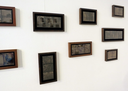
Unfortunately with photography glare can make it hard to capture, but these pieces, composed of two to four small glass plates that make up a larger image, definitely blew me away!

This show is presented by Chashama.org, a non-profit organization that "supports communities by temporarily transforming vacant properties into spaces where artists can flourish." Upcoming events they're putting on include "Bait and Switch," a group show of artists "whose work captures the viewer's attention then pulls the rug out from under them," opening June 22nd right near me in Harlem at 461 West 126th St. 

Daniel Ballesteros - Midwest Filipino 2012 no.5
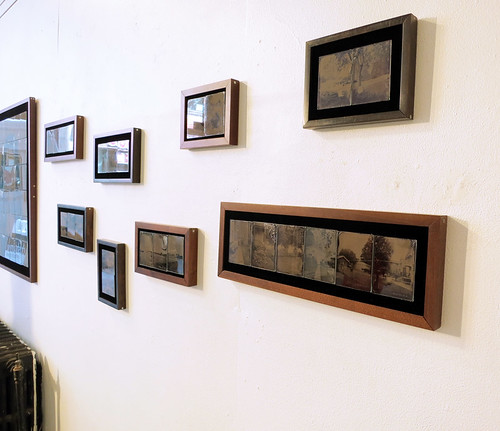
One last shot of the gallery's second wall

This show, "Midwest Fillipino" by Daniel Ballesteros, will be running at 277 W 37th St, New York, NY through June 11th and you all should check it out - I hear there's going to be a closing party featuring wine and cheese! (I know, the end date is super soon, but I only found out about this show by accident.)  If you love tiny things that get better the closer you look, definitely go see this show!

Tuesday, June 5, 2012

Art Show: "Quilts from Nature: Landscapes & Florals" by Lenore Crawford, at The ArtQuilt Gallery in New York

It's that time - The ArtQuilt Gallery has a new show, and once again you all should head over and check it out if you possibly can!  Like their last show that I covered on the blog, "Walking Through Time" by Sue Benner, this collection of quilts bursts with intense colors that seem like they can barely be contained! 

The new show is called "Quilts from Nature: Landscapes & Florals," and features works by Lenore Crawford. These quilts range from medium to large-ish scale and are created using a combination of fusible raw-edge applique and pieced backgrounds.  

Lenore Crawford - The Garden Parasol, Fredrick Fesieke - 2008
"The Garden Parasol, Fredrick Fesieke" - 2008

Ms. Crawford's ability to combine commercial fabrics with hand painted elements greatly impressed me - from a distance her work seems to flow with perfect smoothness from one fabric type to another. When I got closer I enjoyed the challenge of picking out which elements were commercial fabrics from what must be a very impressive stash, and which elements were individually painted. 

Lenore Crawford - Monet's Lily Pond - 2010
"Monet's Lily Pond" - 2010
The show's wall text states,
"Lenore Crawford's fabric art combines her love of France, especially its architecture and gardens, with her passion for color and realism. Lenore's complementary use of texture and painting provide her works with a warmth and vitality only possible with this unique medium. "
The part about warmth and vitality completely made sense to me - these quilts were all able to draw me in and hold my attention for a long time in a way that other works featuring the same subject matter of landscapes and floral designs rarely are able to.  I enjoy both categories of artwork, but generally do not feel compelled by them when they are depicted in other media. 

Lenore Crawford - Hybrid Lily III - 2008
"Hybrid Lily III" - 2008

The fact that both this show and the previous one featured fused fabric with exposed raw edges, plus the fact that in both cases this technique looked excellent and completely professional, makes me want to try bringing some more raw edges into my own work.  In their work Lenore Crawford and Sue Benner use different approaches to how the fabric edges should be secured.  In Sue Benner's quilts, the fused fabric was held securely by quilting motifs that existed independently of the shapes in the cut fabric - the quilting anchored the fabric securely by crossing the raw edges repeatedly over the progress of the design. Lenore Crawford's style involves more use of stitching that catches fabric edges by traveling precisely just along the inside of each design element.  Both methods look fabulous!

Lenore Crawford - House of Roses - 2008
"House of Roses" - 2008


Lenore Crawford - Grand Poppy - 2007
"Grand Poppy" - 2007

This last quilt, "Grand Poppy," is my favorite piece from the show.  In addition to the gorgeous range of colors Ms. Crawford has incorporated into the flower's petals (my photograph seriously does this work NO JUSTICE at all!), the quilt incorporates a beautifully complex background composed of hundreds of tiny pieced squares in an incredible range of colors.  Fields of tiny pieced squares have always been on my list of favorite quilt elements!