Wednesday, October 24, 2012

Upcoming Show: "Art Quilts XVII: Integrating the Paradox" at Visions Gallery in Chandler, Arizona

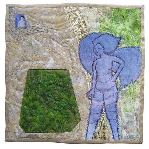
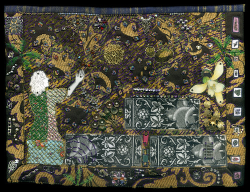
This post is coming slightly later than it should, but I have been accepted the show "Art Quilts XVII: Integrating the Paradox," at the Chandler Center for the Arts in Arizona, and I thought I would put up a sampling of works by some of the other artists who will be participating in the show.  This show will feature work by many people whose work I admire, either because I already knew who they were and was thrilled to find out I would be in a show with them, or because as I was searching for their names on Google, I was surprised over and over again by the talent of these people I had not known about.

This show promises to be pretty darn fabulous, and I have to say I'm quite sad I won't be able to get out to Chandler to see it in person.  If you will be in the area, the works will be on view from November 2, 2012 through January 19, 2013 and you should absolutely check it out (I know, I say this about every show, but it keeps being true!)

Here's the art - some of these are the pieces that will appear in the show, while others are not the ones that will be included, but they should all brighten your day!


"A Rather Attractive Prison," by Pamela Allen
"Sketches #3" by Denise Linet
"Pair O Docks II" by Betty Hahn
"Thought Process 1" by Frances Murphy
"Jet in the Carina Nebula" by Jimmy McBride
"Voice of Experience" by Kathleen Kastles
"Winter's Charms" and "Convergence" by Laura Gaskin
"Delhi Commons" by Neera Huckvale
"The Poemfish" by Sandra Branjord
"Squirrel and Locust" by Sue Reno

"Parallax Patterns" by Sandy Donabed
And finally, here's my piece:
"Habitats" by Stella Belikiewicz

Sunday, September 16, 2012

Art Show: "Line and Color," by Lisa Call at The ArtQuilt Gallery

Once again there is a new show at my favorite venue, The ArtQuilt Gallery in Chelsea, and this time I actually got to go and see the artist speak about her work.  The show, titled "Line & Color," will be on view through October 20th, 2012 and features works by Lisa Call, whom I had not previously known a lot about, but I am now a huge fan.

Lisa Call's gallery talk was filled with witty and informative thoughts on all kinds of topics - I'll include a few of my favorite bits from the notes I took, and hopefully my paraphrasing of her words will not be too inaccurate. As always, please forgive the inconsistency in the photos (for a better idea of what Lisa Call's work looks like, go check it out in person!)
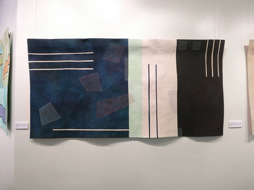
Lisa Call Structures 115 at The ArtQuilt Gallery
"Structures #115"by Lisa Call
One of my favorite things from Lisa Call's talk was her description of her ongoing lack of relationship with what is trendy.  As an artist, she is concerned primarily with beauty and compositional integrity, and with achieving a sort of visual rightness, which is a thing that artists are uniquely inclined to seek out.  This concern for formal design qualities, along with the fact that Lisa Call does not incorporate any fancy cutting edge technology into her work, has meant that she is not walking a path towards trendiness.  This is, I think, true for a fair number of quilt artists, and the thing I took away from Call's talk is that if you approach your work with enough drive and take it seriously enough, you can build a solid career even in the midst of an art world that is not often concerned with the things you care about. 
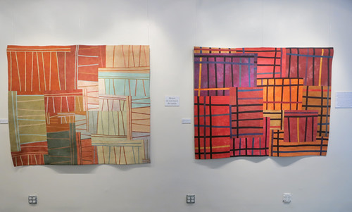
Lisa Call Structures 72 & 32 at The ArtQuilt Gallery
"Structures #72" and "Structures #32"by Lisa Call
Call's total lack of interest in bringing technology into her work is particularly amusing in light of her job as a software engineer.  She's been a part of the computer world for basically forever, and finds that it holds zero interest for her - there is nothing she has to say through her work that cannot be brought about through a series of dyebaths, a twenty year old Pfaff and a massive investment of time. I think nearly all art quilters can appreciate this deliberate decision to embrace slowness in art.  Call says the success of her work may indicate that the world is ready to move towards tactile media again as part of a desire to bring beauty back into the world we inhabit.
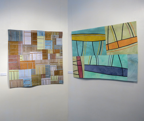
Lisa Call Structures 38 & 143 at The ArtQuilt Gallery
"Structures # 38" and "Structures #143" by Lisa Call

The process Lisa Call uses to construct her quilts is extremely deliberate, and each step, from designing the work on the wall to cutting, piecing and quilting, involves no shortcuts.  As she says, no strip-piecing is involved - if a line is present in a certain spot it is because she specifically meant for it to be there.  I have a lot of respect for this way of working, and I enjoy how different it is from my own approach which favors reacting to a work as it develops in real time over careful planning.  One area where Lisa Call and I have a similar style, however, is dyeing!  Her way of dyeing is in direct contrast to her approach to construction - she uses no formulas, dyes only one yard of fabric at a time, and embraces the "you get what you get" quality that is the result.  Brilliant!
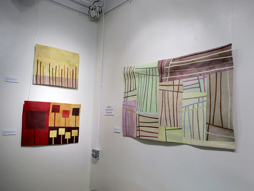
Lisa Call Dream 37 & 38 & Structures 97 at The ArtQuilt Gallery
"Dream "37," "Dream #38," and "Structures #97" by Lisa Call

Two final thoughts from Lisa Call.  The first is her answer to the inevitable question of where the distinction is drawn between functional quilting and Art Quilting.  Her response to this is simple and struck me as incredibly true.  The answer is Intention.  She creates her pieces with the idea that they are art.  That is their purpose, and it is definitely enough. 
The second thing is Call's suggestion of an artist that people interested in her work should also check out.  I think this is something I should bring into my posts on artists whenever it's possible - we can learn vast amounts from asking artists we admire who they go to for inspiration.  Her suggestion of an artist to check out is the painter Richard Diebenkorn, whose work is also carefully planned and meticulous.  

That's it - go check out the show!

Thursday, September 6, 2012

Informative Video on Low Water Immersion Dyeing

I have been doing a fair amount of fiber reactive dyeing recently, and today while trolling YouTube for random video tutorials on the subject, I came across one that quite nicely answers a question I didn't even know I had been meaning to ask.  The question, which I realized I had actually been wondering about ever since I started researching low-water immersion dyeing, is: When, exactly, should you add the soda ash fixative to the dye bath, and what will be the result of adding it at various specific points? 

It turns out someone else was also wondering about this - Glenda Hopp of http://SoManyColors.net has put together a video in which she explores the effects that can be achieved by adding your soda ash in various ways.  I like her no-nonsense approach to dyeing and also to making videos! 


Friday, August 31, 2012

My Work, in "High Fiber Under Five" at San Jose Museum of Quilts & Textiles

I am thrilled that five of my quilts have been accepted into the fifth annual "High Fiber Under Five" benefit show for the San Jose Museum of Quilts & Textiles. This show is devoted exclusively to fiber pieces that are priced at $500 or less, and a portion of the proceeds from each sale (between 50% and 100%) will be donated directly to the museum.

The thing I love about this show is that it is specifically geared towards an audience of people who love fiber art but do not necessarily have the disposable funds to become big time collectors. 

The show runs from October 20 through November 4 of this year, and if you happen to be in the San Jose area, definitely stop in and pick up some gorgeous and affordable art! Also, let me know what you think of the show!

Here are three of my pieces that will be on view (click on the images to view larger versions on Flickr):
I Had a Dream Like That Once
"I Had a Dream Like that Once"

An Oasis for Orphaned Tresure
"An Oasis for Orphaned Treasure"

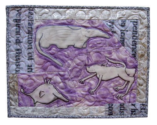
Fictional Animals: Three New Species Discovered on the Very First Day
"Fictional Animals: Three New Species Discovered on the Very First Day"

Thursday, July 19, 2012

My Work, in Quilting Arts Magazine's "From Sketch to Art Quilt" Reader Challenge!

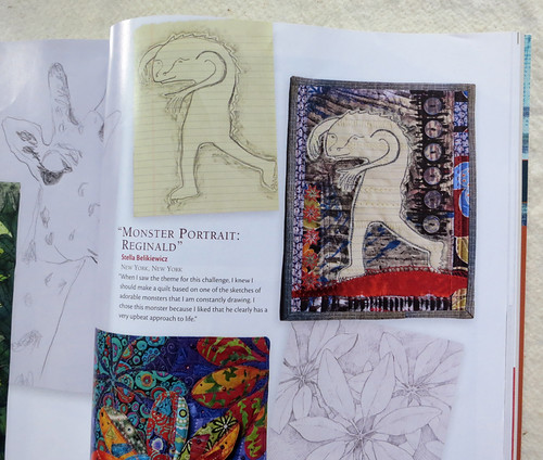
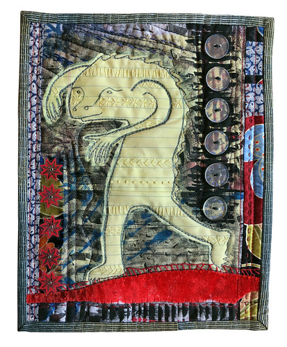
Back in November, when I received the beginning of my Quilting Arts subscription, I was excited to see a reader challenge called "From Sketch to Art Quilt." Exactly the perfect challenge to start with! At the time I was drawing a lot of adorable monsters onto the yellow lined paper pads available at my job, so I decided to turn one of those sketches into the basis for my quilt.  I had been having fun for a while already with quilts based on various monsters and "fictional animals."

My work in Quilting Arts Magazine
My work, featured in a magazine!

I scanned the sketch at high resolution and printed it out in cotton in two sections, just for fun. The size of the quilts in this challenge is 8 by 10 inches, so in theory I could have printed the monster all on a single piece of cotton, but I knew I was going to be monoprinting on top of the inkjet, and I wanted to have the option of an image in which the underlying monster drawing appeared to flow seamlessly across the whole quilt while its background broke abruptly into two sections.  In the end, the monoprinting that I did, with a Gelli Arts reusable "gelatin" plate, ended up looking similar on both parts of the image. I created a mask for the monster from freezer paper, ironed it into place on each piece of the monster body, then had fun playing around with my Gelli Arts plate. Once my printing was complete, I put the quilt together, with all kinds of added details including embroidery and laminated images.

Quilting Arts June/July 2012 Cover (the issue with my work in it)
Quilting Arts June/July 2012 Issue

I was super excited to have my quilt accepted into this particular Reader Challenge, and sent it off to the folks at Quilting Arts, along with the original sketch. They do their magazine photography in-house, and took very good care of my quilt which they eventually returned to me along with a copy of the issue. 
"Monster Portrait: Reginald"

Title: "Monster Portrait: Reginald"
Materials: various commercial fabrics, inkjet printed cotton, acrylic paint, laminated imagery, metal eyelets, embroidery floss, buttons
Dimensions: 8" by 10"
Date: 2012

Monday, June 18, 2012

New Quilt - "Blue Space #1"

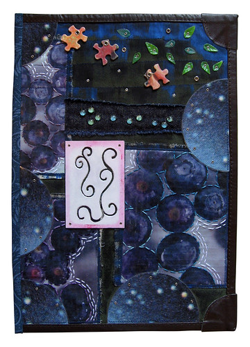
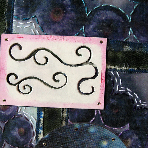
In addition to having sat around nearly finished in a box for at least three years, this quilt has an additional claim to fame.  The curlycues cut from mat board that are attached to the center of the quilt have been with me since high school! That's right, in one of my first ever printmaking classes we were assigned to create plates for embossing watercolor paper by cutting imagery into mat board.  Several coats of gesso later, it turns out that thing will not only be able to pull a giant number of embossed prints but also survive to be reinvented fourteen years later!

Another fun element of this quilt is the background photographs, which I took of blueberries floating in a bowl of water and then printed onto iron-on transfers.  I like that it's obvious what you're looking at but at the same time they seem like they could be something else entirely. 
Blue Space #1
"Blue Space #1"

Title: "Blue Space #1"
Materials: half of a dollar store placemat, plastic leaves, metal eyelets, puzzle pieces, plastic dots, prong settings, perle cotton, muslin, iron-on transfers, laminated imagery, mat board, acrylic paint, oil paint stick
Dimensions: 9.5" by 13"
Date: 2012
 
quilt-blue-space2
Puzzle pieces, iron on transfers, metal eyelets and little plastic bauble thingies that are meant for floral arrangements

The little plastic bauble things at the bottom of the photo above are one of the sad disappointments I've had in my search for art materials.  I found a big bag of them at a craft store - they're meant to be placed in the bottom of a vase as an attractive way to hold up floral arrangements.  They seemed PERFECT for adding small dots of imagery to my quilts, because they're produced by dripping tiny amounts of molten clear plastic onto a surface, which produces basically a little round clear cabochon the perfect size to fit into a 30SS prong setting meant for Swarovski crystals. My method of using these little guys involved using a 3/16" hole punch to make tiny dots of content from magazine pages which I would adhere to the flat side of the little baubles using clear epoxy.  I could then attach them anywhere on a quilt using the prong settings.  They were gorgeous.  If this seems too perfect to be true, that's definitely because it is.  The fatal flaw of these little gems, which I did not discover until I had used them in a number of projects, is that they are extraordinarily brittle.  Even a slight impact against a hard surface causes them to shatter. It was tragic to give up on this idea, but I refuse to use anything in my art that will randomly shatter!

quilt-blue-space3
Swirly thing carved into a piece of mat board


This piece of mat board with swirly things carved into it is one of those items that I have had for many, many years.  I carved the little swirls to make an embossing plate during one of my first ever printmaking classes, way back in high school. The pink around the edge is there because the project in question involved combining the embossing with a silkscreened image, and my idea was to leave a little window in my red ink to accommodate the embossing.  Afterward, of course, I couldn't possibly get rid of the mat board with the swirls carved into it - it only took me fifteen years to find a home for it!

Tuesday, June 12, 2012

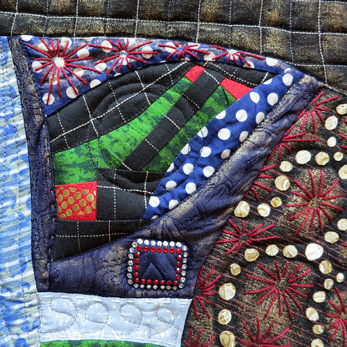
New Quilt: "Map of Regional Attractions #3"

quilt-map-of-regional-attractions3.1
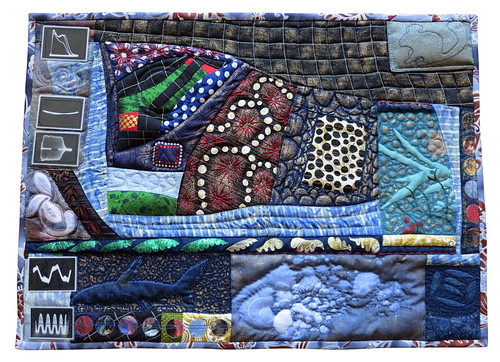
"Map of Regional Attractions #3"

Title: "Map of Regional Attractions #3"
Materials: cottons & synthetic fabrics, tulle, lace, inkjet printed cotton, oil paint stick, laminated imagery, perle cotton, Swarovski crystals, press-on sequins
Dimensions: 20.5" by 14.75"
Date: 2012

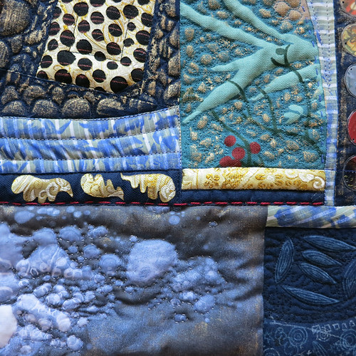
This quilt makes heavy use of oil paint sticks, which I have recently realized are an incredibly powerful tool for adding texture or imagery to a quilt. The shark was made using the paint stick "carbon paper" technique I demonstrated in this post, and other areas have antique gold pigment applied using the tip of my finger onto already quilted areas.  This produced a beautiful and dramatic effect that I will definitely have to explore further.

quilt-map-of-regional-attractions3.4
The shark was created by tracing a drawing on paper with paint stick pigment liberally applied to the back side.

The graph-y looking images were from a book titled "101 Ways to Use Your Sweep Generator," which was found at a Goodwill in Seattle a million years ago.  I had no idea at the time what a Sweep Generator was, and I have to admit, I still have no idea because instead of reading the book like a normal person, I immediately cut out all the fabulous illustrations and laminated them.  They've been slowly finding their way into projects ever since.

quilt-map-of-regional-attractions3.2
The little rectangle of Swarovski crystals were leftover from a Rockette costume.

This quilt was mostly completed while my new machine was out for repairs, and so I got to know the old Pfaff again.  That thing may be old, but it's still a rock star in my book!

quilt-map-of-regional-attractions3.3
The photograph printed onto cotton at the bottom of the quilt is of the frozen surface of the Harlem Meer in Central Park.  I used hand-quilting to accentuate the bubbles captured in the ice.

One question about this quilt that will just have to be answered by time is whether oil paint stick pigment will remain on fabric without being heat-set. This was the project for which I decided to try out Poly-Fil Hi-Loft batting, which it turns out gets all compressed and useless when you expose it to heat, so I just have to hope all the gold will stay on there.  Maybe I'll post a follow-up in ten years!