Showing posts with label 2012. Show all posts

Sunday, January 6, 2013

New Quilt - "Welcome Complexities #2"

Welcome Complexities #2
"Welcome Complexities #2"

Title: Welcome Complexities #2
Materials: muslin, commercial cottons & other fabrics, inkjet printed fabric, chalk pastel, fabric paint, beads, crayon, oil paint sticks, permanent marker, sequins, heat transfer foil, iron-on sequins
Dimensions: 18.75" by 13.25"

Click on details below to view larger versions on Flickr. 
quilt-welcome-comlexities2.1quilt-welcome-comlexities2.2

This quilt is from mid-2012, and it's my first big experiment with using oil paint sticks by rubbing the tip directly on the fabric surface.  After this successful trial, I am in love with them, and the complexity they add to a quilt.  It's like once you bring paint sticks into the picture, your quilt automatically acquires a whole new layer of age and wisdom! 

Wednesday, October 24, 2012

Upcoming Show: "Art Quilts XVII: Integrating the Paradox" at Visions Gallery in Chandler, Arizona

This post is coming slightly later than it should, but I have been accepted the show "Art Quilts XVII: Integrating the Paradox," at the Chandler Center for the Arts in Arizona, and I thought I would put up a sampling of works by some of the other artists who will be participating in the show.  This show will feature work by many people whose work I admire, either because I already knew who they were and was thrilled to find out I would be in a show with them, or because as I was searching for their names on Google, I was surprised over and over again by the talent of these people I had not known about.

This show promises to be pretty darn fabulous, and I have to say I'm quite sad I won't be able to get out to Chandler to see it in person.  If you will be in the area, the works will be on view from November 2, 2012 through January 19, 2013 and you should absolutely check it out (I know, I say this about every show, but it keeps being true!)

Here's the art - some of these are the pieces that will appear in the show, while others are not the ones that will be included, but they should all brighten your day!


"A Rather Attractive Prison," by Pamela Allen
"Sketches #3" by Denise Linet
"Pair O Docks II" by Betty Hahn
"Thought Process 1" by Frances Murphy
"Jet in the Carina Nebula" by Jimmy McBride
"Voice of Experience" by Kathleen Kastles
"Winter's Charms" and "Convergence" by Laura Gaskin
"Delhi Commons" by Neera Huckvale
"The Poemfish" by Sandra Branjord
"Squirrel and Locust" by Sue Reno

"Parallax Patterns" by Sandy Donabed
And finally, here's my piece:
"Habitats" by Stella Belikiewicz

Sunday, September 16, 2012

Art Show: "Line and Color," by Lisa Call at The ArtQuilt Gallery

Once again there is a new show at my favorite venue, The ArtQuilt Gallery in Chelsea, and this time I actually got to go and see the artist speak about her work.  The show, titled "Line & Color," will be on view through October 20th, 2012 and features works by Lisa Call, whom I had not previously known a lot about, but I am now a huge fan.

Lisa Call's gallery talk was filled with witty and informative thoughts on all kinds of topics - I'll include a few of my favorite bits from the notes I took, and hopefully my paraphrasing of her words will not be too inaccurate. As always, please forgive the inconsistency in the photos (for a better idea of what Lisa Call's work looks like, go check it out in person!)

Lisa Call Structures 115 at The ArtQuilt Gallery
"Structures #115"by Lisa Call
One of my favorite things from Lisa Call's talk was her description of her ongoing lack of relationship with what is trendy.  As an artist, she is concerned primarily with beauty and compositional integrity, and with achieving a sort of visual rightness, which is a thing that artists are uniquely inclined to seek out.  This concern for formal design qualities, along with the fact that Lisa Call does not incorporate any fancy cutting edge technology into her work, has meant that she is not walking a path towards trendiness.  This is, I think, true for a fair number of quilt artists, and the thing I took away from Call's talk is that if you approach your work with enough drive and take it seriously enough, you can build a solid career even in the midst of an art world that is not often concerned with the things you care about. 

Lisa Call Structures 72 & 32 at The ArtQuilt Gallery
"Structures #72" and "Structures #32"by Lisa Call
Call's total lack of interest in bringing technology into her work is particularly amusing in light of her job as a software engineer.  She's been a part of the computer world for basically forever, and finds that it holds zero interest for her - there is nothing she has to say through her work that cannot be brought about through a series of dyebaths, a twenty year old Pfaff and a massive investment of time. I think nearly all art quilters can appreciate this deliberate decision to embrace slowness in art.  Call says the success of her work may indicate that the world is ready to move towards tactile media again as part of a desire to bring beauty back into the world we inhabit.

Lisa Call Structures 38 & 143 at The ArtQuilt Gallery
"Structures # 38" and "Structures #143" by Lisa Call

The process Lisa Call uses to construct her quilts is extremely deliberate, and each step, from designing the work on the wall to cutting, piecing and quilting, involves no shortcuts.  As she says, no strip-piecing is involved - if a line is present in a certain spot it is because she specifically meant for it to be there.  I have a lot of respect for this way of working, and I enjoy how different it is from my own approach which favors reacting to a work as it develops in real time over careful planning.  One area where Lisa Call and I have a similar style, however, is dyeing!  Her way of dyeing is in direct contrast to her approach to construction - she uses no formulas, dyes only one yard of fabric at a time, and embraces the "you get what you get" quality that is the result.  Brilliant!

Lisa Call Dream 37 & 38 & Structures 97 at The ArtQuilt Gallery
"Dream "37," "Dream #38," and "Structures #97" by Lisa Call

Two final thoughts from Lisa Call.  The first is her answer to the inevitable question of where the distinction is drawn between functional quilting and Art Quilting.  Her response to this is simple and struck me as incredibly true.  The answer is Intention.  She creates her pieces with the idea that they are art.  That is their purpose, and it is definitely enough. 
The second thing is Call's suggestion of an artist that people interested in her work should also check out.  I think this is something I should bring into my posts on artists whenever it's possible - we can learn vast amounts from asking artists we admire who they go to for inspiration.  Her suggestion of an artist to check out is the painter Richard Diebenkorn, whose work is also carefully planned and meticulous.  

That's it - go check out the show!

Friday, August 31, 2012

My Work, in "High Fiber Under Five" at San Jose Museum of Quilts & Textiles

I am thrilled that five of my quilts have been accepted into the fifth annual "High Fiber Under Five" benefit show for the San Jose Museum of Quilts & Textiles. This show is devoted exclusively to fiber pieces that are priced at $500 or less, and a portion of the proceeds from each sale (between 50% and 100%) will be donated directly to the museum.

The thing I love about this show is that it is specifically geared towards an audience of people who love fiber art but do not necessarily have the disposable funds to become big time collectors. 

The show runs from October 20 through November 4 of this year, and if you happen to be in the San Jose area, definitely stop in and pick up some gorgeous and affordable art! Also, let me know what you think of the show!

Here are three of my pieces that will be on view (click on the images to view larger versions on Flickr):
I Had a Dream Like That Once
"I Had a Dream Like that Once"

An Oasis for Orphaned Tresure
"An Oasis for Orphaned Treasure"

Fictional Animals: Three New Species Discovered on the Very First Day
"Fictional Animals: Three New Species Discovered on the Very First Day"

Thursday, July 19, 2012

My Work, in Quilting Arts Magazine's "From Sketch to Art Quilt" Reader Challenge!

Back in November, when I received the beginning of my Quilting Arts subscription, I was excited to see a reader challenge called "From Sketch to Art Quilt." Exactly the perfect challenge to start with! At the time I was drawing a lot of adorable monsters onto the yellow lined paper pads available at my job, so I decided to turn one of those sketches into the basis for my quilt.  I had been having fun for a while already with quilts based on various monsters and "fictional animals."

My work in Quilting Arts Magazine
My work, featured in a magazine!

I scanned the sketch at high resolution and printed it out in cotton in two sections, just for fun. The size of the quilts in this challenge is 8 by 10 inches, so in theory I could have printed the monster all on a single piece of cotton, but I knew I was going to be monoprinting on top of the inkjet, and I wanted to have the option of an image in which the underlying monster drawing appeared to flow seamlessly across the whole quilt while its background broke abruptly into two sections.  In the end, the monoprinting that I did, with a Gelli Arts reusable "gelatin" plate, ended up looking similar on both parts of the image. I created a mask for the monster from freezer paper, ironed it into place on each piece of the monster body, then had fun playing around with my Gelli Arts plate. Once my printing was complete, I put the quilt together, with all kinds of added details including embroidery and laminated images.

Quilting Arts June/July 2012 Cover (the issue with my work in it)
Quilting Arts June/July 2012 Issue

I was super excited to have my quilt accepted into this particular Reader Challenge, and sent it off to the folks at Quilting Arts, along with the original sketch. They do their magazine photography in-house, and took very good care of my quilt which they eventually returned to me along with a copy of the issue. 
"Monster Portrait: Reginald"

Title: "Monster Portrait: Reginald"
Materials: various commercial fabrics, inkjet printed cotton, acrylic paint, laminated imagery, metal eyelets, embroidery floss, buttons
Dimensions: 8" by 10"
Date: 2012

Monday, June 18, 2012

New Quilt - "Blue Space #1"

In addition to having sat around nearly finished in a box for at least three years, this quilt has an additional claim to fame.  The curlycues cut from mat board that are attached to the center of the quilt have been with me since high school! That's right, in one of my first ever printmaking classes we were assigned to create plates for embossing watercolor paper by cutting imagery into mat board.  Several coats of gesso later, it turns out that thing will not only be able to pull a giant number of embossed prints but also survive to be reinvented fourteen years later!

Another fun element of this quilt is the background photographs, which I took of blueberries floating in a bowl of water and then printed onto iron-on transfers.  I like that it's obvious what you're looking at but at the same time they seem like they could be something else entirely. 
Blue Space #1
"Blue Space #1"

Title: "Blue Space #1"
Materials: half of a dollar store placemat, plastic leaves, metal eyelets, puzzle pieces, plastic dots, prong settings, perle cotton, muslin, iron-on transfers, laminated imagery, mat board, acrylic paint, oil paint stick
Dimensions: 9.5" by 13"
Date: 2012
 
quilt-blue-space2
Puzzle pieces, iron on transfers, metal eyelets and little plastic bauble thingies that are meant for floral arrangements

The little plastic bauble things at the bottom of the photo above are one of the sad disappointments I've had in my search for art materials.  I found a big bag of them at a craft store - they're meant to be placed in the bottom of a vase as an attractive way to hold up floral arrangements.  They seemed PERFECT for adding small dots of imagery to my quilts, because they're produced by dripping tiny amounts of molten clear plastic onto a surface, which produces basically a little round clear cabochon the perfect size to fit into a 30SS prong setting meant for Swarovski crystals. My method of using these little guys involved using a 3/16" hole punch to make tiny dots of content from magazine pages which I would adhere to the flat side of the little baubles using clear epoxy.  I could then attach them anywhere on a quilt using the prong settings.  They were gorgeous.  If this seems too perfect to be true, that's definitely because it is.  The fatal flaw of these little gems, which I did not discover until I had used them in a number of projects, is that they are extraordinarily brittle.  Even a slight impact against a hard surface causes them to shatter. It was tragic to give up on this idea, but I refuse to use anything in my art that will randomly shatter!

quilt-blue-space3
Swirly thing carved into a piece of mat board


This piece of mat board with swirly things carved into it is one of those items that I have had for many, many years.  I carved the little swirls to make an embossing plate during one of my first ever printmaking classes, way back in high school. The pink around the edge is there because the project in question involved combining the embossing with a silkscreened image, and my idea was to leave a little window in my red ink to accommodate the embossing.  Afterward, of course, I couldn't possibly get rid of the mat board with the swirls carved into it - it only took me fifteen years to find a home for it!

Thursday, June 7, 2012

Art Show: "Midwest Filipino" by Daniel Ballesteros, presented by Chashama.org

Today, I had one of those wonderful serendipitous New York moments that I personally have too few of because I almost never leave my apartment.  I was walking along 37th Street, heading towards the subway, when I spotted a teeny tiny storefront gallery full of what looked like hundreds of miniscule black and white photographs.  A sign on the door encouraged me to come in, so I did just that, and I'm so glad I did - this is exactly my kind of art!   

All the tiny photos turn out to be the work of Daniel Ballesteros, a photographer originally hailing from St. Louis, Missouri and currently operating in Brooklyn. See the bottom of this post for location and dates!

Ballesteros makes tintypes, a photographic process I did not know much about - Wikipedia describes the process this way: "a photograph made by creating a direct positive on a sheet of iron metal that is blackened by painting, lacquering or enamelling and is used as a support for a collodion photographic emulsion."

The show contains two different presentations for Ballesteros's photographs.  The first group are individually mounted to the wall on tiny custom supports that appear to be made from an upside down version of the channeled molding that holds the chalk at the bottom of a blackboard.  They're probably no more than 3 by 4 inches, and it is incredibly rewarding to get up close to each one and peer at it to see what is revealed.

The second presentation method involves photographic prints on glass, in series of two or three or many more, held into simple wooden frames using loops of wire.  These are incredibly beautiful and mysterious, and there are excellent flaws in the glass or the emulsion that I was particularly drawn to. 
 
Daniel Ballesteros - Midwest Filipino 2012 no.1
Small individual photographs by Daniel Ballesteros

I'm just going to quote some big chunks of Ballesteros's website, because his artist statement is well written and informative, and a far cry from the pretentious crap that can be either written after hours of painstaking fruitless labor or, much more easily, created with zero effort using the Arty Bollocks instant artist statement generator.  I promise I won't always use all these giant block quotes, but I like Ballesteros's description of his work more than any description I could come up with, and if that makes me lazy, I won't even try to get out of being called that! Anyway, here's some of what he has to say about his series, "Midwest Filipino."
"This project is about my experience as a Filipino American coming from an area of the U.S. with very little Filipino culture, and a family that did what it could to assimilate as best as possible. The first part of the project, addressing the successful assimiliation of my Filipino Grandfather into the U.S., is a series of photographs of the environment and people that helped to shape my identity - without Filipino influence."
Daniel Ballesteros - Midwest Filipino 2012 no.2
A larger work comprising thirty individually printed photographs on glass

(continued) "The Midwest is in many ways a perfect backdrop for assimilation stories. It once attracted numerous European immigrants (Dutch, German, French, Italian, and Irish) who filled many midwest neighborhoods along with their countrymen. Over time, those culturally rich communities "Americanized" and lost much of their own identity among the suburban sprawl of tract houses and strip malls that now typify the region."
Daniel Ballesteros - Midwest Filipino 2012 no.3
More of the tiny images - I adore the way they work with the weird existing wall features in this gallery space.

(continued - I added the bold part because I just think this bit is so very cool!) "For this series, the self-portrait of Midwest Filpino, I have made wet plate collodion positive images on both metal and glass from digital snapshots. Once a plate is made, the digital file is then erased, so that one unique collodion plate remains--a single physical token pulled from a digital recording--looking at its expression, its storage abilities that we embrace and pretend to manage. As external hard drives stack up on desktops (virtual and actual), the topic of utility arises, highlighting how helpful modernization really is, and our tendency to save everything (because it is so easy). In my work and life, I see one beautiful aspect of the human memory being its abilitiy to forget things, unconsciously filter out what seems unimportant, reinterpret all that appears to inhibit our progress, whether truly threatening or just perceived as being so. And like this human memory, my pictures are imperfect and flawed, lacking the precise in precise detail. The images for this series are two steps removed from their original scene and decades distanced in regards to process. They are represented in sometimes-cloudy warm monotones. They are small plates that possess a digital time and date stamp to reference their place in multiple eras at once, (both having a common interest in the practice of seeing and recording)."
Daniel Ballesteros - Midwest Filipino 2012 no.4
Unfortunately with photography glare can make it hard to capture, but these pieces, composed of two to four small glass plates that make up a larger image, definitely blew me away!

This show is presented by Chashama.org, a non-profit organization that "supports communities by temporarily transforming vacant properties into spaces where artists can flourish." Upcoming events they're putting on include "Bait and Switch," a group show of artists "whose work captures the viewer's attention then pulls the rug out from under them," opening June 22nd right near me in Harlem at 461 West 126th St. 

Daniel Ballesteros - Midwest Filipino 2012 no.5
One last shot of the gallery's second wall

This show, "Midwest Fillipino" by Daniel Ballesteros, will be running at 277 W 37th St, New York, NY through June 11th and you all should check it out - I hear there's going to be a closing party featuring wine and cheese! (I know, the end date is super soon, but I only found out about this show by accident.)  If you love tiny things that get better the closer you look, definitely go see this show!

Tuesday, June 5, 2012

Art Show: "Quilts from Nature: Landscapes & Florals" by Lenore Crawford, at The ArtQuilt Gallery in New York

It's that time - The ArtQuilt Gallery has a new show, and once again you all should head over and check it out if you possibly can!  Like their last show that I covered on the blog, "Walking Through Time" by Sue Benner, this collection of quilts bursts with intense colors that seem like they can barely be contained! 

The new show is called "Quilts from Nature: Landscapes & Florals," and features works by Lenore Crawford. These quilts range from medium to large-ish scale and are created using a combination of fusible raw-edge applique and pieced backgrounds.  

Lenore Crawford - The Garden Parasol, Fredrick Fesieke - 2008
"The Garden Parasol, Fredrick Fesieke" - 2008

Ms. Crawford's ability to combine commercial fabrics with hand painted elements greatly impressed me - from a distance her work seems to flow with perfect smoothness from one fabric type to another. When I got closer I enjoyed the challenge of picking out which elements were commercial fabrics from what must be a very impressive stash, and which elements were individually painted. 

Lenore Crawford - Monet's Lily Pond - 2010
"Monet's Lily Pond" - 2010
The show's wall text states,
"Lenore Crawford's fabric art combines her love of France, especially its architecture and gardens, with her passion for color and realism. Lenore's complementary use of texture and painting provide her works with a warmth and vitality only possible with this unique medium. "
The part about warmth and vitality completely made sense to me - these quilts were all able to draw me in and hold my attention for a long time in a way that other works featuring the same subject matter of landscapes and floral designs rarely are able to.  I enjoy both categories of artwork, but generally do not feel compelled by them when they are depicted in other media. 

Lenore Crawford - Hybrid Lily III - 2008
"Hybrid Lily III" - 2008

The fact that both this show and the previous one featured fused fabric with exposed raw edges, plus the fact that in both cases this technique looked excellent and completely professional, makes me want to try bringing some more raw edges into my own work.  In their work Lenore Crawford and Sue Benner use different approaches to how the fabric edges should be secured.  In Sue Benner's quilts, the fused fabric was held securely by quilting motifs that existed independently of the shapes in the cut fabric - the quilting anchored the fabric securely by crossing the raw edges repeatedly over the progress of the design. Lenore Crawford's style involves more use of stitching that catches fabric edges by traveling precisely just along the inside of each design element.  Both methods look fabulous!

Lenore Crawford - House of Roses - 2008
"House of Roses" - 2008


Lenore Crawford - Grand Poppy - 2007
"Grand Poppy" - 2007

This last quilt, "Grand Poppy," is my favorite piece from the show.  In addition to the gorgeous range of colors Ms. Crawford has incorporated into the flower's petals (my photograph seriously does this work NO JUSTICE at all!), the quilt incorporates a beautifully complex background composed of hundreds of tiny pieced squares in an incredible range of colors.  Fields of tiny pieced squares have always been on my list of favorite quilt elements!

Tuesday, May 29, 2012

New Quilt: "Fictional Animal: White Bird of Legend"

This long-necked bird ended up being my first ever whole-cloth quilt.  The background fabric is heavily disguised with textural elements, but it started out as a sleeve from a green plaid button-down shirt (you can see the cuff opening with button hole on the quilt's bottom right).

To make the outline for the bird, I traced one of my drawings onto the fabric using the "Look Ma, I Invented Carbon Paper!" technique (tutorial coming soon!), then painted inside the lines with white fabric paint.  The painting process took FOR EVER, and I am going to have to look for quicker, easier methods to fill in an outline on textured fabric with a flat, opaque color.

After the bird was painted, I had fun adding random cross-hatching using regular Crayola crayons, and even did a little bit of rubbing using a colander for texture.  You can see that part right above the bird's knobbly knees.  I also added black fabric paint to the bottom of the quilt with a roller.

I chose a very high-loft polyester batting to accentuate the quilted texture, and finished off the design by adding a small amount of white, blue and gold oil paint stick on the raised areas. 
Fictional Animal: White Bird of Legend
"Fictional Animal: White Bird of Legend"
Title: "Fictional Animal: White Bird of Legend" 
Materials: cotton shirt fabric, oil paint stick, fabric paint, crayon
Dimensions: 11.25" by 12.75"
Date: 2012

quilt-fictional-animal-white-bird-of-legend3quilt-fictional-animal-white-bird-of-legend2

Tuesday, May 15, 2012

My Donation for the 2012 SAQA Benefit Auction

"The Art of Inclusion #1"

Title: "The Art of Inclusion #1"
Materials: commercial cottons and sheer fabrics, hand-dyed cotton, inkjet printed cotton, wood, fabric pen, embroidery floss, beads, acrylic paint, polymer clay, laminated images and text, postage stamp, 6B pencil, metal eyelets, piece of a gold-leafed book cover, plastic parts, Shrinky Dinks
Dimensions: 12" by 12"
Date: 2012

This year, as part of my progress towards actually trying to sell my work, I joined the Studio Art Quilt Associates, which, for anyone not familiar with it, is a large professional organization for art quilters.  I was thrilled to see that I had joined literally just in time to make a quilt for inclusion in their annual Benefit Auction. The rules for this auction are simple: Make one original 12" square art quilt, and get it to the auction folks by the first of June 2012.  I immediately swung into action! 

quilt-art-of-inclusion001.4
Detail showing hand embroidery, free motion quilting, Shrinky Dinks (!), and pieces from pinball-style party favor games I had picked up years ago at a dollar store

For my very first donation to the SAQA auction, I decided to jump in and make the debut quilt in a series I have been thinking about for a while. The quilts in this series will actually all share the title of my blog, because they will hopefully be the best possible expression of my dedication to the Art of Inclusion.  The goal is to make a very large series of quilts, sized either 12" or 15" square, that will be created purely to provide homes for the zillions of little details and bits and pieces I am always creating.

quilt-art-of-inclusion001.3
In the bottom left corner, a my drawing of a numbat, inkjet printed onto fabric, plus a laminated postage stamp

In addition to my main goal of Include-All-The-Things, this series will have two other interesting elements.  First, my approach to the design of these quilts will not be based on a landscape or portrait based way of working with my available space, but instead on the concept of filling in the space with existing elements as I go along, and creating small custom pieces to fill in gaps.  This is probably the way I work best, and has always produced beautiful results. A great example of the fill-it-in approach is this quilt from 2008.

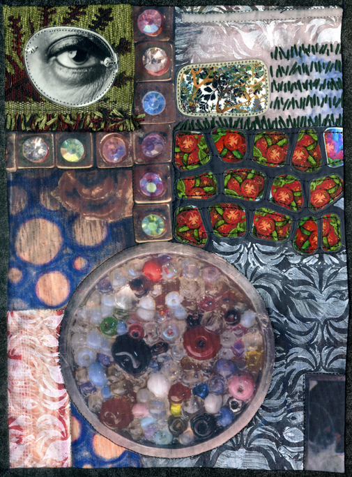
"Filling Spaces: Eye, Tomatoes, Patterns"

The second idea behind the "Art of Inclusion" series is that these quilts, because they are square, will be able to work either separately or together as "blocks" in a larger wall installation.  I have always worked small, and that is not likely to change, but most quilt shows would prefer larger work, and I do like the idea of my quilts being able to command a room.

quilt-art-of-inclusion001.2
A photograph of some kelp from an old science textbook, glued onto plywood and cut out on my scroll saw, plus laminated random lines of text and a monster

I've included a number of juicy details in this first Art of Inclusion quilt, and many of them have been with me, waiting patiently, for years! There's the painted polymer clay monster mask with the broken ear, the free motion quilting sample of leaves stitched onto a scrap of plaid shirt, the laminated postage stamp, the traced Shrinky Dink leaves from the book of Khmer Ornament, and the drawing of a numbat inkjet printed onto fabric.  There's the scan of a marble I found on the street, the chunks of an unfinished cross stitch project my mother donated to my efforts, the random laminated lines of text from long-forgotten books, and the plastic covers from dollar store party favor games that used to be filled with ball bearings and now contain piles of beads.... And that's not even a fraction of my stash!

Saturday, May 12, 2012

Art All Night 2012 (post 3 of 3!)

Here is the final installment of my photos, taken of people's artwork during Art All Night 2012.  I would welcome any comments if anyone has anything they'd like to say about the work, though of course since I am not the artist I can't actually answer any complex questions about these pieces!

AAN 001 STELLA ART
First off, my work!  These were actually on display in the first room, so hopefully lots of people saw them before becoming totally exhausted.  Nobody bought them, though - oh well!

AAN 018 Fotographia by Jason Striner - photography
"Fotographia" by Jason Striner, Photography

AAN 019 Battling Bones by Brayden Mason Age 10 - pen & ink
"Battling Bones" by Brayden - Age 10, Pen & ink

AAN 020 Poet Dennis Brutus by Bob Ziller - print
"Poet Dennis Brutus" by Bob Ziller, Print

AAN 021 Jungle Fever by Coleen Rush - dyed silk & stitching
"Jungle Fever" by Coleen Rush, Dyed silk & stitching

AAN 021 Jungle Fever by Coleen Rush - dyed silk & stitching DETAIL
"Jungle Fever" by Coleen Rush, Detail

AAN 022 Gypsy Summer by Una Sincyr - wood wire & Fabric
"Gypsy Summer" by Una Sincyr, Wood, wire & fabric

AAN 022 Gypsy Summer by Una Sincyr - wood wire & Fabric DETAIL
"Gypsy Summer" by Una Sincyr, Detail

AAN 023 Old Bill by Anthony Purcell - acrylic on wood panel
"Old Bill" by Anthony Purcell, Acrylic on wood panel

AAN 024 Untitled by Jerome Schmeltz - mixed media
Untitled by Jerome Schmeltz, Mixed media

AAN 025 Untitled by Chloe Cummings Age 10 - crayon & marker
Untitled by Chloe - Age 10, Crayon & marker

AAN 026 Clown Interrogation by Brian Kaldorf - photography
"Clown Interrogation" by Brian Kaldorf, Photography

AAN 027 Wysteria by Milicent Nolan - mosaic glass
"Wysteria" by Milicent Nolan, Mosaic glass

AAN 028 Jerk by Kacyn Keys - felt on canvas
"Jerk" by Kacyn Keys, Felt on canvas

AAN 029 Spotted in the Deep by Kate Graves - ink and acid free paper
"Spotted in the Deep" by Kate Graves, Ink and acid free paper

AAN 030 Color Picker (Photoshop CS3) by Jim Rugg - ballpoint pen on notebook paper
"Color Picker (Photoshop CS3)" by Jim Rugg, Ballpoint pen on notebook paper (I thought this was one of the most clever pieces in the show! Exactly my kind of thing, especially the fact that the entire notebook is included in the piece)

AAN 031 Untitled by Jennifer Rogers - recycled materials
Untitled by Jennifer Rogers, Recycled materials

AAN 032 Kevin by Victoria Carr - mosaic on wood
"Kevin" by Victoria Carr, Mosaic on wood

AAN 033 I Love Lucy by Richard Boniker - etch-a-sketch
"I Love Lucy" by Richard Boniker, etch-a-sketch

AAN 034 Flying Gets Old by Nicole Adams - Digital
"Flying Gets Old" by Nicole Adams, Digital

AAN 035 Polyburgh by Thomas Soltis - Digital
"Ponyburgh" by Thomas Soltis, Digital - this year's Art All Night included a whole lot of My Little Pony themed artwork - this one was my favorite in that category!

Art All Night 2012 was fabulous, hope to see some of you there next year!