Showing posts with label New York City. Show all posts

Monday, April 15, 2013

Art Show: "Pleased to Meet You" at Materials For The Arts

For the past several months I have been having a glorious time volunteering a couple of days a week at Materials For The Arts, my absolutely favorite arts-based nonprofit organization in New York.

I had known about these guys for several years but had never been there until I started volunteering.  MFTA is seriously like some sort of magical wonderland in which nothing that could be used to create art ever has to become garbage ever again.  Also, deserving and underfunded arts groups and schools can have access to all the materials they need to enrich the lives of New Yorkers.  I freaking love this whole concept, and all the dedicated people at MFTA do every part of the process so well!  Have I been drinking the Kool-Aid? YOU BET.

Anyway, Materials For The Arts is having their staff show, "Pleased to Meet You," right now and they offered to let me put in a few pieces!  I attended the show's opening night this past Thursday, and it was a wonderful evening, with fun conversation, tasty cheeses, excellent artwork and not a single moment of pretentious or boring conversation. How many experiences contain all those things?

I took some photos at the event, so please enjoy these images of some of the pieces in the show (though by no means all of them!).  Then go check out MFTA's website and blog!

If you live in the New York area and you have some sort of art supply you'd like to go to a good cause, definitely get in touch with them - no donation is too small, and even the weirdest stuff is guaranteed to end up exactly where it needs to be! 

And now, some ART!

PTMY Crochet Environment by Olek
When you first arrive at MFTA you know you're already in a different world (Art Work = "Crochet Environment" by Olek)

PTMY hallway entrance
The fabulously industrial hallway space where the show is installed - look, there are my pieces right at the beginning!

PTMY House by Dan Darbandi
"House" by Dan Darbandi

PTMY Green Orbit by Jenny Kraft and Green Being by Chase Carlisle
"Green Orbit" by Jenny Kraft and "Green Being" by Chase Carlisle

PTMY Installation Recopilacion II by Luisa Tamara
"Installation Recopilacion II" by Luisa Tamara

PTMY Bird is Visiting by Sabu
"Bird is Visiting" by Sabu

PTMY Art Darts by John Cloud Kaiser of Freeystyle Family
"Art Darts" by John Cloud Kaiser of Freeystyle Family

PTMY For Steppenwolf by Marna Chester
"For Steppenwolf" by Marna Chester (rotating sculpture, exterior and interior views shown)

PTMY Chair by Joel Frank
"Chair" by Joel Frank

PTMY Magic Forest by Doris Littlejohn
"Magic Forest" by Doris Littlejohn

PTMY two untitled pieces by Ben Pederson
Two untitled pieces by current MFTA Artist in Residence Ben Pederson

Friday, April 12, 2013

Art Show, "Paths: Sculpture & Watercolor by Kathy Creutzburg," at Michael Mut Gallery

I often end up going to exciting art events because someone I know is acquainted with an artist. In this case, it turns out my boyfriend is friends with a woman who embodies one of the exciting New York City Artist tropes - Kathy Creutzburg is a painter, sculptor and mixed media artist who lives in the East Village and makes things from other things that she has found.

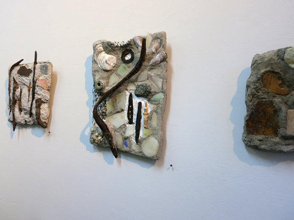
Kathy's show, at Michael Mut Gallery on Avenue C, consists of both two dimensional and sculptural work. I was most drawn to her paintings and wall-mounted mosaics so those are the pieces I'm featuring here.

The show includes subtle, thoughtful touches that I noticed and appreciated.  First, Kathy's work is perfectly sized to fit attractively into the space available (Michael Mut Gallery is a teeny, intimate space which really gives smaller artwork the opportunity to shine as it should). Kathy worked with a curator for her show, Marie Katherine Vigneau, who provided help around which works were selected and how the space was used. The second thing I noticed is a small thing, but it made me really happy - the gallery uses those little thumb tacks with embossed numbers on them to indicate how to find a work on the price list.  Adorable and classy!

Michael Mut Gallery's website has this to say about the show:

"Paths is a collection based on an artist's journey. Her materials and ideas are collected remnants found along different paths. Some of these paths are taken alone, while others are shared. As we move forward, trails both tangible and invisible are left behind. The East River, becomes a metaphor for process, meandering in one direction and then another. .... The watercolors illustrate the journey whereas the sculptures embody the outcome of the voyage."

My favorite works in this show were the pieces that most directly reflected the title.  These are small scale watercolor paintings which contain literal map-like elements. Seeing these little imagined map paintings made me realize that there are a lot of fiber artists whose work is based on making maps, like Emily Miah Stewart, Linda Gass, Valerie Goodwin, and sometimes me! My theory about why this theme emerges so often for fiber artists is that we are very concerned with seeking meaningful ways of filling space, since we have to actively construct every part of our work. 

I wrote a few questions for Kathy based on my thoughts about her show, and she very kindly carved out some time to give excellent answers to them.  Read her responses below, then go see her work:

"Paths," through April 27, 2013  
Michael Mut Gallery 
97 Avenue C at 6th St 


Larger paintings featuring stenciled designs

Could you give some thoughts about what it was like to work your curator?  How did she help to clarify the show's message? What was the selection process like for determining which pieces ended up in the show (joyful, painful, somewhere in between)?

I came across Michael Mutt's gallery a couple of years ago. He is an artist, and I participated in one of his projects. I live right around the corner from the gallery, on 7th Street between B and C. More recently, I asked Michael to look at my artwork at my studio- which is in the back, behind my apartment. He came over, and he offered me a solo show. I was kind of surprised (and ecstatic!) because I had never had one. Marie Vigneau works with Michael, and was my curator, and she was very thoughtful about her choices of which pieces to put in the show. We had the freedom to find the direction that the show would go. After looking over the watercolors and  sculptures on several occasions, particular groups of work began to blend together. I have been working on the idea of paths for a number of years, and the idea seemed to bridge my public art projects with my personal work. We began with the show title Paths That Lead There, which was edited to Paths. I really appreciate feedback from the people I work with because it allows me to think of my artwork in a new way. The edited title addresses the work that we were choosing, as well as opening up new possibilities for future work.

Kathy's work has a fantastic sense of something happening just beyond what we can actually see.

(continued...) In the past, I have collaborated with other artists, a writer, students, teachers, family members, etc., so working with others is part of what I do. My feeling is that more than one mind just adds dimension to artwork. Since Marie and I were both new, we did not begin with pre-conceived ideas about how to create an exhibit. I felt like I had taken my time to find my direction as an artist (which is the hardest part!), and the process had run its course. Marie was then able to think about which pieces fit together aesthetically, and how to place them to make them the most effective. She was also reconciling the connection between the watercolors and sculptures, how paintings of the maps and the sculptures were related. Michael also offered some guidance, as well as my son, Klay. Movement paths connect with so much of what I am doing in so many different ways. There is both a physical and a psychological dimension to the idea. It affects my daily life.

Four small scale map-themed watercolor paintings

You clearly made some very thoughtful choices about how to price your work, and I am curious about how you arrived at your price structure.  As both a fellow artist and a very non-wealthy New Yorker I was greatly impressed by your decision to include incredibly affordable pieces in your show, allowing normal people to own original artwork.

I priced the artwork to be accessible to my present audience, and because I, too, love to purchase art and I lack the budget to do it. I think back to what was affordable to people who have bought from me in the past, and what I have made on commissioned pieces. I really want to put my artwork out for people to enjoy, and the best way to do that is to make it affordable.

Mosaic style pieces made from found objects collected along the East River

Since I normally write about fiber art, I would love to hear whether you have ever made any pieces using fiber techniques such as quilting, weaving, felting, embroidery and dyeing.

I have studied weaving, and when I was a student, I designed and built my own counterbalance floor loom. I was really fascinated with building a machine, and figuring out how the parts work together. I still have my loom, but it is not set up (mostly due to space issues). I also sew and do needlepoint, when a project calls for something like that. At any rate, I find myself bending and twisting things such as wires, steel rod and recycled materials in such a manner that echoes the soothing rhythm of fiber art processes.

The postcard for Cathy's show

Sunday, January 20, 2013

Art Show: "Painting on Fabric," by Peggy Brown at The Art Quilt Gallery

Once again there is a new show at my favorite New York art venue, The Art Quilt Gallery!

The current show, "Painting on Fabric," features quilted pieces by Peggy Brown.  Because Ms. Brown has come to quilting from a career as a watercolorist and mixed-media painter, she brings an unusual approach and set of skills into her art quilts. As soon as I visited Peggy Brown's website prior to stopping by the gallery, I knew that this show would not be quite like any I have seen so far at The Art Quilt Gallery, and that I would love her work! 

As always, forgive the less-than-perfect photography...

Peggy Brown -Another Form II
"Another Form II" by Peggy Brown

 One reason these quilts feel so substantially different from others I have seen at The Art Quilt Gallery is that Peggy Brown, in many of her pieces, incorporates quantities of beautifully worn and wrinkled watercolor paper, creating a very leathery book-like surface.  The quilts that feature areas of painted paper have a substantial quality, and they feel almost like ancient and accidental artifacts.

Peggy Brown -Winter Water
"Winter Water" by Peggy Brown

 My sense that something magical and accidental must be transpiring is apparently not too crazy, as Brown describes her painting and quilting processes this way:
"My studio time is divided between “paintings on paper” and my newer obsession,”paintings on fabric.”  I approach both from the viewpoint of a watercolor artist using the same media and methods I have used for years. To begin, I wet the substrate, either paper or fabric, then freely brush on paint letting the pigments mingle and follow their personal paths as they dry.  This process may be repeated several times for more depth and richness.  After drying the marks on the paper or fabric inspire and help me choose a way to continue and complete the image. My goal is to take a free-flowing start, and using collage, overlays of more pigment and drawing, compose a well-designed finish."

Peggy Brown -In Motion
"In Motion" by Peggy Brown

 Some of the quilts also incorporate digital imagery, and Brown has successfully tackled one of the major challenges faced by quilt artists who use digital processes in our work: her pieces have none of that aggravating telltale quality that makes a quilt seem to scream, "Parts of me were printed out from a computer, isn't it distracting!" The elements of her work described as "digital transfers to silk" have a fabulous deep, jewel-like quality that definitely drew me in. 

Peggy Brown -New Directions
"New Directions" by Peggy Brown

 Brown had this to say about what she hopes her work will communicate:
"I try to express images that are on, above and below the surface. By keeping each painted layer transparent, I invite the viewer to follow as I work and perceive the process from tentative beginnings to the final touch.  Some of my beginnings become non-objective abstracts.  Some become landscapes or still life. The entire process is collaboration between watercolor - the medium; and myself - the artist. I think we both enjoy ourselves."

Peggy Brown -When September Ends
"When September Ends" by Peggy Brown
Peggy Brown's work absolutely reinforces my belief that, to bring in a quote from my own artist statement, "quilting is the most exciting medium a person could choose because an artist can, quite literally, incorporate elements from any other medium into an art quilt. There are very few techniques [one cannot] bring to an art quilt, and I enjoy the challenge of translating between the qualities that define a quilt and the qualities inherent in other media - they often can seem completely contradictory," but in reality are wonderfully symbiotic.

As I always say, if you're able you should absolutely go forth and check out the gorgeous pieces in Peggy Brown's show! It will make your day and make you want to mix a few different media together in your own studio when you get home.  

Sunday, September 16, 2012

Art Show: "Line and Color," by Lisa Call at The ArtQuilt Gallery

Once again there is a new show at my favorite venue, The ArtQuilt Gallery in Chelsea, and this time I actually got to go and see the artist speak about her work.  The show, titled "Line & Color," will be on view through October 20th, 2012 and features works by Lisa Call, whom I had not previously known a lot about, but I am now a huge fan.

Lisa Call's gallery talk was filled with witty and informative thoughts on all kinds of topics - I'll include a few of my favorite bits from the notes I took, and hopefully my paraphrasing of her words will not be too inaccurate. As always, please forgive the inconsistency in the photos (for a better idea of what Lisa Call's work looks like, go check it out in person!)

Lisa Call Structures 115 at The ArtQuilt Gallery
"Structures #115"by Lisa Call
One of my favorite things from Lisa Call's talk was her description of her ongoing lack of relationship with what is trendy.  As an artist, she is concerned primarily with beauty and compositional integrity, and with achieving a sort of visual rightness, which is a thing that artists are uniquely inclined to seek out.  This concern for formal design qualities, along with the fact that Lisa Call does not incorporate any fancy cutting edge technology into her work, has meant that she is not walking a path towards trendiness.  This is, I think, true for a fair number of quilt artists, and the thing I took away from Call's talk is that if you approach your work with enough drive and take it seriously enough, you can build a solid career even in the midst of an art world that is not often concerned with the things you care about. 

Lisa Call Structures 72 & 32 at The ArtQuilt Gallery
"Structures #72" and "Structures #32"by Lisa Call
Call's total lack of interest in bringing technology into her work is particularly amusing in light of her job as a software engineer.  She's been a part of the computer world for basically forever, and finds that it holds zero interest for her - there is nothing she has to say through her work that cannot be brought about through a series of dyebaths, a twenty year old Pfaff and a massive investment of time. I think nearly all art quilters can appreciate this deliberate decision to embrace slowness in art.  Call says the success of her work may indicate that the world is ready to move towards tactile media again as part of a desire to bring beauty back into the world we inhabit.

Lisa Call Structures 38 & 143 at The ArtQuilt Gallery
"Structures # 38" and "Structures #143" by Lisa Call

The process Lisa Call uses to construct her quilts is extremely deliberate, and each step, from designing the work on the wall to cutting, piecing and quilting, involves no shortcuts.  As she says, no strip-piecing is involved - if a line is present in a certain spot it is because she specifically meant for it to be there.  I have a lot of respect for this way of working, and I enjoy how different it is from my own approach which favors reacting to a work as it develops in real time over careful planning.  One area where Lisa Call and I have a similar style, however, is dyeing!  Her way of dyeing is in direct contrast to her approach to construction - she uses no formulas, dyes only one yard of fabric at a time, and embraces the "you get what you get" quality that is the result.  Brilliant!

Lisa Call Dream 37 & 38 & Structures 97 at The ArtQuilt Gallery
"Dream "37," "Dream #38," and "Structures #97" by Lisa Call

Two final thoughts from Lisa Call.  The first is her answer to the inevitable question of where the distinction is drawn between functional quilting and Art Quilting.  Her response to this is simple and struck me as incredibly true.  The answer is Intention.  She creates her pieces with the idea that they are art.  That is their purpose, and it is definitely enough. 
The second thing is Call's suggestion of an artist that people interested in her work should also check out.  I think this is something I should bring into my posts on artists whenever it's possible - we can learn vast amounts from asking artists we admire who they go to for inspiration.  Her suggestion of an artist to check out is the painter Richard Diebenkorn, whose work is also carefully planned and meticulous.  

That's it - go check out the show!

Thursday, June 7, 2012

Art Show: "Midwest Filipino" by Daniel Ballesteros, presented by Chashama.org

Today, I had one of those wonderful serendipitous New York moments that I personally have too few of because I almost never leave my apartment.  I was walking along 37th Street, heading towards the subway, when I spotted a teeny tiny storefront gallery full of what looked like hundreds of miniscule black and white photographs.  A sign on the door encouraged me to come in, so I did just that, and I'm so glad I did - this is exactly my kind of art!   

All the tiny photos turn out to be the work of Daniel Ballesteros, a photographer originally hailing from St. Louis, Missouri and currently operating in Brooklyn. See the bottom of this post for location and dates!

Ballesteros makes tintypes, a photographic process I did not know much about - Wikipedia describes the process this way: "a photograph made by creating a direct positive on a sheet of iron metal that is blackened by painting, lacquering or enamelling and is used as a support for a collodion photographic emulsion."

The show contains two different presentations for Ballesteros's photographs.  The first group are individually mounted to the wall on tiny custom supports that appear to be made from an upside down version of the channeled molding that holds the chalk at the bottom of a blackboard.  They're probably no more than 3 by 4 inches, and it is incredibly rewarding to get up close to each one and peer at it to see what is revealed.

The second presentation method involves photographic prints on glass, in series of two or three or many more, held into simple wooden frames using loops of wire.  These are incredibly beautiful and mysterious, and there are excellent flaws in the glass or the emulsion that I was particularly drawn to. 
 
Daniel Ballesteros - Midwest Filipino 2012 no.1
Small individual photographs by Daniel Ballesteros

I'm just going to quote some big chunks of Ballesteros's website, because his artist statement is well written and informative, and a far cry from the pretentious crap that can be either written after hours of painstaking fruitless labor or, much more easily, created with zero effort using the Arty Bollocks instant artist statement generator.  I promise I won't always use all these giant block quotes, but I like Ballesteros's description of his work more than any description I could come up with, and if that makes me lazy, I won't even try to get out of being called that! Anyway, here's some of what he has to say about his series, "Midwest Filipino."
"This project is about my experience as a Filipino American coming from an area of the U.S. with very little Filipino culture, and a family that did what it could to assimilate as best as possible. The first part of the project, addressing the successful assimiliation of my Filipino Grandfather into the U.S., is a series of photographs of the environment and people that helped to shape my identity - without Filipino influence."
Daniel Ballesteros - Midwest Filipino 2012 no.2
A larger work comprising thirty individually printed photographs on glass

(continued) "The Midwest is in many ways a perfect backdrop for assimilation stories. It once attracted numerous European immigrants (Dutch, German, French, Italian, and Irish) who filled many midwest neighborhoods along with their countrymen. Over time, those culturally rich communities "Americanized" and lost much of their own identity among the suburban sprawl of tract houses and strip malls that now typify the region."
Daniel Ballesteros - Midwest Filipino 2012 no.3
More of the tiny images - I adore the way they work with the weird existing wall features in this gallery space.

(continued - I added the bold part because I just think this bit is so very cool!) "For this series, the self-portrait of Midwest Filpino, I have made wet plate collodion positive images on both metal and glass from digital snapshots. Once a plate is made, the digital file is then erased, so that one unique collodion plate remains--a single physical token pulled from a digital recording--looking at its expression, its storage abilities that we embrace and pretend to manage. As external hard drives stack up on desktops (virtual and actual), the topic of utility arises, highlighting how helpful modernization really is, and our tendency to save everything (because it is so easy). In my work and life, I see one beautiful aspect of the human memory being its abilitiy to forget things, unconsciously filter out what seems unimportant, reinterpret all that appears to inhibit our progress, whether truly threatening or just perceived as being so. And like this human memory, my pictures are imperfect and flawed, lacking the precise in precise detail. The images for this series are two steps removed from their original scene and decades distanced in regards to process. They are represented in sometimes-cloudy warm monotones. They are small plates that possess a digital time and date stamp to reference their place in multiple eras at once, (both having a common interest in the practice of seeing and recording)."
Daniel Ballesteros - Midwest Filipino 2012 no.4
Unfortunately with photography glare can make it hard to capture, but these pieces, composed of two to four small glass plates that make up a larger image, definitely blew me away!

This show is presented by Chashama.org, a non-profit organization that "supports communities by temporarily transforming vacant properties into spaces where artists can flourish." Upcoming events they're putting on include "Bait and Switch," a group show of artists "whose work captures the viewer's attention then pulls the rug out from under them," opening June 22nd right near me in Harlem at 461 West 126th St. 

Daniel Ballesteros - Midwest Filipino 2012 no.5
One last shot of the gallery's second wall

This show, "Midwest Fillipino" by Daniel Ballesteros, will be running at 277 W 37th St, New York, NY through June 11th and you all should check it out - I hear there's going to be a closing party featuring wine and cheese! (I know, the end date is super soon, but I only found out about this show by accident.)  If you love tiny things that get better the closer you look, definitely go see this show!

Tuesday, June 5, 2012

Art Show: "Quilts from Nature: Landscapes & Florals" by Lenore Crawford, at The ArtQuilt Gallery in New York

It's that time - The ArtQuilt Gallery has a new show, and once again you all should head over and check it out if you possibly can!  Like their last show that I covered on the blog, "Walking Through Time" by Sue Benner, this collection of quilts bursts with intense colors that seem like they can barely be contained! 

The new show is called "Quilts from Nature: Landscapes & Florals," and features works by Lenore Crawford. These quilts range from medium to large-ish scale and are created using a combination of fusible raw-edge applique and pieced backgrounds.  

Lenore Crawford - The Garden Parasol, Fredrick Fesieke - 2008
"The Garden Parasol, Fredrick Fesieke" - 2008

Ms. Crawford's ability to combine commercial fabrics with hand painted elements greatly impressed me - from a distance her work seems to flow with perfect smoothness from one fabric type to another. When I got closer I enjoyed the challenge of picking out which elements were commercial fabrics from what must be a very impressive stash, and which elements were individually painted. 

Lenore Crawford - Monet's Lily Pond - 2010
"Monet's Lily Pond" - 2010
The show's wall text states,
"Lenore Crawford's fabric art combines her love of France, especially its architecture and gardens, with her passion for color and realism. Lenore's complementary use of texture and painting provide her works with a warmth and vitality only possible with this unique medium. "
The part about warmth and vitality completely made sense to me - these quilts were all able to draw me in and hold my attention for a long time in a way that other works featuring the same subject matter of landscapes and floral designs rarely are able to.  I enjoy both categories of artwork, but generally do not feel compelled by them when they are depicted in other media. 

Lenore Crawford - Hybrid Lily III - 2008
"Hybrid Lily III" - 2008

The fact that both this show and the previous one featured fused fabric with exposed raw edges, plus the fact that in both cases this technique looked excellent and completely professional, makes me want to try bringing some more raw edges into my own work.  In their work Lenore Crawford and Sue Benner use different approaches to how the fabric edges should be secured.  In Sue Benner's quilts, the fused fabric was held securely by quilting motifs that existed independently of the shapes in the cut fabric - the quilting anchored the fabric securely by crossing the raw edges repeatedly over the progress of the design. Lenore Crawford's style involves more use of stitching that catches fabric edges by traveling precisely just along the inside of each design element.  Both methods look fabulous!

Lenore Crawford - House of Roses - 2008
"House of Roses" - 2008


Lenore Crawford - Grand Poppy - 2007
"Grand Poppy" - 2007

This last quilt, "Grand Poppy," is my favorite piece from the show.  In addition to the gorgeous range of colors Ms. Crawford has incorporated into the flower's petals (my photograph seriously does this work NO JUSTICE at all!), the quilt incorporates a beautifully complex background composed of hundreds of tiny pieced squares in an incredible range of colors.  Fields of tiny pieced squares have always been on my list of favorite quilt elements!